• Jetzt anmelden. Es dauert nur 2 Minuten und ist kostenlos!

[GELOEST] Texte nebeneinandersetzen

Panda

Neues Mitglied
Hallo,
ich versuche zwei Texte nebeneinander zu bekommen, was aber nicht geht ich habe es schon mit float und display:inline-block versucht. Wie mache ich außerdem, dass sich die Elemente beim Ausrichten nicht verschieben. Bitte mit Beispiel-Codes erklären. Danke im Voraus :)

hier der HTML code
Code:
<!DOCTYPE html>
<html lang="en">
  <head>
    <title>live and let learn</title>
    <meta http-equiv="Content-Type" content="text/html; charset=utf-8">
  </head>
  <body>

    <div id="header">
      <blockquote>
        <p>Learning is not a privilege, it's a right.</p>
      </blockquote> 
      <div id="logo">
        <h1>live and let learn</h1>
        <img src="live-and-let-learn.jpg" alt="live and let learn">
      </div>

    </div>

    <div id="content">
      <div id="content-side">
        <dl>
          <dt><a href="services/">Services</a></dt>
          <dd>Learning and facilitation through TAFE WSI</dd>

          <dt><a href="learning/">Personal Learning</a></dt>
          <dd>Learning from the network</dd>

          <dt><a href="resources/">Resources</a></dt>
          <dd>Browse through resources ...</dd>

          <dt><a href="about/">About</a></dt>
          <dd>What am I about? Personal interests and other stuff</dd>
        </dl>
      </div> <!-- content-side -->

      <div id="content-main">
        <h2>Please update your links!</h2>
        <small>Wednesday, October 12th, 2005</small>

        <p>New blog address: <a href="[URL]http://liveandletlearn.net/learning/[/URL]">
          [URL]http://liveandletlearn.net/learning/[/URL]</a>
        </p>
        <p>During the last holidays I've been busy moving my blog from
          <a href="[URL]http://www.absoludity.net/blog/[/URL]">absoludity.net</a> to
          <a href="[URL]http://liveandletlearn.net/learning/[/URL]">liveandletlearn.net</a>
          ... why? Good question! Part of the Web Design course that I
          facilitate is a client project where participants are required to
          develop a site from start to finish - and i'd been a while since
          I'd been through that process myself - so what better a project
          for the holidays (next to my gardening project to get me <em>away</em>
          from the computer)!
        </p>

        <p>You'll notice that the site itself is still in prototype stage,
          but the blog is all up and running so I'm going to be using
          liveandletlearn from now on. <strong>Please update your
          bookmarks/feeds</strong>! And please give me any feedback
          you've got time for at
          <a href="[URL]http://liveandletlearn.net/learning/[/URL]">liveandletlearn.net</a>!
        </p>    
    </div> <!-- content-main -->
    </div>  <!-- content -->
  </body>
</html>
CSS Code(möglicherweise ziemlich kaputt)

 body{
    width:75%;
    margin:0px;
    padding:0px;
    background-color:white;}
    /*text nach links machen*/


    /*bild nach links setzen*/
    img{
    display: inline-block;
    text-align:start;
    width:15%;}


    #header{
    font-family: 'Roboto', sans-serif;
    text-align:end;
    margin:50px;}


    #logo h1{
    font-family: 'Oswald', sans-serif;
    font-size:4;
    text-align:start;}

 /*dt dd a*/
     #content{                 
    display: block;
    width: 200px;
    background-color: #dddddd;    
    text-decoration: none;
    }
    /*Links in navibar ändern*/
    #content-side dl{
    list-style-type: none;
    font-family: 'Encode Sans Condensed', sans-serif;
    }

     #content-side dl a{
    float:left;          /*Aufzählungspunkte horizontal machen*/
    padding: 8px;
    text-decoration: none;
}
 

#content-main{
display:flex;
float:right;
width:100%;
justify-content:center;}[/code


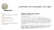
PS ich hab außerdem Schwierigkeiten bei h1 zwei unterschiedliche Schriftarten zu machen. Das Bild wies aussehen soll ist unten angehängt.
 

Anhänge

  • Screen Shot 2022-11-09 at 21.26.35.png
    Screen Shot 2022-11-09 at 21.26.35.png
    589,8 KB · Aufrufe: 4
Werbung:
Ich verstehe deine Fragen leider nur teilweise.

Wie mache ich außerdem, dass sich die Elemente beim Ausrichten nicht verschieben.

Welche Elemente sollen sich nicht verschieben und was meinst du mit "Ausrichten". Meinst du unterschiedliche Fensterbreiten? Das sich Elemente denen anpassen ist gewollt und sinnvoll. Wie die sich anpassen kannst du mit CSS vorgeben.

ich hab außerdem Schwierigkeiten bei h1 zwei unterschiedliche Schriftarten zu machen

Der Text enthält nur ein h1-Element. Wenn ein Text mehrere h1-Elemente hat können die über sogenannte Selektoren einzeln angepasst werden.

ich versuche zwei Texte nebeneinander zu bekommen

float und inline-block sind dafür nicht geeignet und auch nicht vorgesehen. Dafür gibt es bereits seit mehreren Jahren Flexbox (display: flex) und CSS-Grid (display: grid). Ich habe mal ein Beispiel nur mit dem notwendigen CSS erstellt. Den Quelltext habe ich nicht geändert, obwohl der nicht den aktuellen HTML-Richtlinien entspricht. Nur die Rahmen habe ich der besseren Übersicht wegen hinzugefügt.

Es geht mir nur darum zu zeigen, wie Texte ab einer bestimmten Fensterbreite nebeneinander gestellt werden können. Andere Formatierungen wie Schriftarten, Abstände, Farben lasse ich der besseren Übersichtlichkeit des Quelltextes wegen außen vor.

Code:
<!DOCTYPE html>
<html lang="en">
<head>
   <meta charset="utf-8">
   <title>live an let learn 01</title>
   <meta name="description" content="Platzhalter - Ein kurze Beschreibung des Inhalts in Satzform">
   <meta name="viewport" content="width=device-width, initial-scale=1.0">

   <style>

   @media all {
      body {
         margin: 0;
         display: grid;
      }
      body>* {
         padding: 0.5rem;
         border: 2px solid grey;
         border-radius: 0.5rem;
         margin: 0.5rem;
      }
   }

   @media all {
      #header blockquote {
         margin-left: 0;
         margin-right: 0;
      }
   }
   @media only screen and (min-width: 800px) {
      #header {
         display: grid;
         gap: 1rem;
         grid-template-columns: 1fr 1fr;
      }
      #header blockquote {
         order: 2;
      }
      #header #logo {
         order: 1;
      }
   }

   @media only screen and (min-width: 800px) {
      #content {
         display: grid;
         gap: 3rem;
         grid-template-columns: auto 1fr;
      }
   }

   </style>
</head>
<body>
   <div id="header">
      <blockquote>
         <p>Learning is not a privilege, it's a right.</p>
      </blockquote>
      <div id="logo">
         <h1>live and let learn</h1>
         <img src="https://upload.wikimedia.org/wikipedia/commons/6/6f/Csschallenge5.jpg" alt="live and let learn">
      </div>
   </div>
   <div id="content">
      <div id="content-side">
         <dl>
            <dt><a href="services/">Services</a></dt>
            <dd>Learning and facilitation through TAFE WSI</dd>
            <dt><a href="learning/">Personal Learning</a></dt>
            <dd>Learning from the network</dd>
            <dt><a href="resources/">Resources</a></dt>
            <dd>Browse through resources ...</dd>
            <dt><a href="about/">About</a></dt>
            <dd>What am I about? Personal interests and other stuff</dd>
         </dl>
      </div> <!-- content-side -->
      <div id="content-main">
         <h2>Please update your links!</h2>
         <small>Wednesday, October 12th, 2005</small>
         <p>New blog address: <a href="http://liveandletlearn.net/learning/">
               http://liveandletlearn.net/learning/</a>
         </p>
         <p>During the last holidays I've been busy moving my blog from
            <a href="http://www.absoludity.net/blog/">absoludity.net</a> to
            <a href="http://liveandletlearn.net/learning/">liveandletlearn.net</a>
            ... why? Good question! Part of the Web Design course that I
            facilitate is a client project where participants are required to
            develop a site from start to finish - and i'd been a while since
            I'd been through that process myself - so what better a project
            for the holidays (next to my gardening project to get me <em>away</em>
            from the computer)!
         </p>
         <p>You'll notice that the site itself is still in prototype stage,
            but the blog is all up and running so I'm going to be using
            liveandletlearn from now on. <strong>Please update your
               bookmarks/feeds</strong>! And please give me any feedback
            you've got time for at
            <a href="http://liveandletlearn.net/learning/">liveandletlearn.net</a>!
         </p>
      </div> <!-- content-main -->
   </div> <!-- content -->
</body>
</html>
 
Zurück
Oben