
• Jetzt anmelden. Es dauert nur 2 Minuten und ist kostenlos!

Responsive Gestaltung

montababa

Neues Mitglied
Hallo zusammen,

nun brauch ich wieder eure Hilfe :smile:

Habe auf meiner Seite zum üben ein Problem mit der Responsiveness.
Alles sieht perfekt aus, solange ich es auf einem Desktop öffne:

1718628560626.png

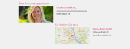
Sobald ich das Fenster verkleiner, wird die Formatierung nicht mehr wie es sein soll:
mittlere Größe:
1718628648856.png

kleinste Größe(Smartphone)

1718628701351.png

Hier ist mein Code:
HTML:
<div class="grau"
     style="padding-top: 20px; padding-left: 150px; padding-right: 150px; padding-bottom: 40px; margin-bottom: 0">
    <div class="col" style="float: left">
        <div class="row"><h4 style="color: #d75e7d">Ihre Ansprechpartnerin</h4></div>
        <div class="row">
            <div class="col"><img src="chantal.jpg" alt="Chantal" height="130" width="270"></div>
            <div class="col">
                <div>
                    <div style="color: #d75e7d; font-weight: bold">CHANTAL SÉNÉCHAL</div>
                    <div><a href="mailto:[email protected]" style="color: #7c7c7c">[email protected]</a>
                    </div>
                    <div>0228 90822-18</div>
                </div>
            </div>
        </div>
    </div>
    <div class="col" style="float: right">
        <div class="row"><h4 style="color: #d75e7d">So finden Sie uns</h4></div>
        <div class="row">
            <div class="col"><img src="adresse.jpg" alt="Karte" height="130" width="270"></div>
            <div class="col">
                <div class="col">
                    <div style="color: #d75e7d; font-weight: bold">Die Medialen GmbH</div>
                    <div>Colmantstraße 39</div>
                    <div><a href="https://www.diemedialen.de/" style="color: #7c7c7c">www.diemedialen.de</a></div>
                </div>
            </div>
        </div>
    </div>
</div>

CSS:
.grau {
            background-color: #f0f0f0;
            min-height: 100%;
            width: 100%;
            margin-top: 40px;
            display: inline-block;
        }

Ich möchte es so haben, dass bei kleinen Displays es untereinander angeordnet ist.

Vielen Dank im Voraus :smile:

Beste Grüße

Monty
 
float ist dem Zusammenhang sachlich falsch. float ist nur dafür gedacht, damit Text andere Objekte (in der Regel Bilder) umfließt. Aber nicht, um Objekte nebeneinander anzuordnen.

Für die Lösung deines Problems ist mit aktuellem HTML und CSS "CSS-Grid" entwickelt worden (display: grid;).

Die Berechnung von Größen (zum Beispiel bei Bildern) überlässt man heutzutage den Browsern.

Ich habe mal ein Beispiel mit korrektem HTML erstellt. Dabei kam es mir in erster Linie um die Darstellung bei unterschiedlichen Bildschirmbreiten an, nicht um die Formatierung von Text oder ähnlichem.

Code:
<!DOCTYPE html>
<html lang="de">
<head>
   <meta charset="utf-8">
   <title>CSS-Grid: Container Query</title>
   <meta name="description" content="Platzhalter - Ein kurze Beschreibung des Inhalts in Satzform">
   <meta name="viewport" content="width=device-width, initial-scale=1.0">

   <!-- <link href="../css/zentrale.css" rel="stylesheet"> -->

   <style>

   /* Überschriften - font-family: 'Roboto Slab', Serif; */
   @import url(https://fonts.googleapis.com/css?family=Roboto+Slab);

   /* Fließtext - font-family: 'Roboto', Sans-Serif"; */
   @import url(https://fonts.googleapis.com/css?family=Roboto);

   /* Basisangaben */
   @media all {
      * {
         /* box-sizing: border-box; */
         min-width: 1px;
      }
      html {
      }
      body {
         padding: 1rem 1rem 2rem 1rem;
         margin: 0rem auto 0rem auto;
      }
   }

   /* Schriften */
   @media all {
      html {
         font-family: sans-serif;
         font-size: 120%;
         line-height: 1.3;
      }
      h1 {
         font-family: 'Roboto Slab', serif;
         font-size: 1.2rem;
         letter-spacing: 0.1rem;
         margin: 0.5rem 0rem 0.5rem 0rem;
      }
      h2, h3, h4, h5, h6 {
         font-family: 'Roboto Slab', serif;
         font-size: 1rem;
         margin: 0.5rem 0rem 0.5rem 0rem;
      }
      p, li, dl, dt, address {
         font-family: Roboto, sans-serif;
         font-size: 1rem;
         font-style: normal;
         margin: 0.5rem 0rem 0.5rem 0rem;
      }
      a {
         /* darkblue */
         color: hsla(240, 100%, 27%, 1);
         text-decoration: none;
         outline: none;
         margin: 0rem 0rem 0rem 0rem;
      }
      figcaption {
         font-family: Roboto, sans-serif;
         font-size: 0.9rem;
         margin: 0rem 0rem 0rem 0rem;
      }
   }

   /* Grafiken */
   @media all {
      figure {
         text-align: center;
         min-width: 1px;
         max-width: 100%;
         min-height: 1px;
         margin: 0rem;
         display: inline-block;
      }
      img {
         min-width: 1px;
         display: block;
         max-width: 100%;
         border: 0px;
      }
      figcaption {
         text-align: left;
         display: inline-block;
      }
   }

   /* .container-query */
   @media all {
      .container-query {
         background-color: #F0F0F0;
         padding: 1rem 2rem;
         display: grid;
         grid-template-columns: repeat(auto-fit, minmax(350px, 1fr));
         gap: 1rem;
      }
      .container-query>* {
         container-type: inline-size;
      }
      @container (min-width: 550px) {
      .container-query>*>* {
         display: grid;
         grid-template-columns: repeat(2, 1fr);
         gap: 1rem;
      }
      .container-query>:nth-child(1) h2 {
         text-transform: uppercase;
      }
      .container-query>*>*>section:nth-of-type(2) {
         margin-top: 3rem;
      }
      }
   }

   </style>
</head>
<body>
   <header id="pageheader" class="pageheader">
      <h1>CSS-Grid: Container Query</h1>
   </header>
   <nav id="navigation" class="navigation">
   </nav>
   <main id="content" class="content">
      <section class="container-query">
         <article>
            <div>
               <section>
                  <h2>Ihre Anprechpartnerin</h2>
                  <figure>
                     <img src="https://about.me/cdn-cgi/image/q=40,dpr=2,f=auto,fit=contain,w=1200,h=753.1380753138076/https://assets.about.me/background/users/c/h/a/chantal.senechal_1418333262_13.jpg">
                     <figcaption>Chantal Sénéchal</figcaption>
                  </figure>
               </section>
               <section>
                  <h2>Chantal Sénéchal</h2>
                  <p><a href="mailto:[email protected]">[email protected]</a></p>
                  <p><a href="tel:+49228908220">0228 90822-0</a></p>
               </section>
            </div>
         </article>
         <article>
            <div>
               <section>
                  <h2>So finden Sie uns</h2>
                  <figure>
                     <img src="https://promediare.com/wp-content/uploads/2018/09/karte_vogelsang_osm.jpg?w=608">
                     <figcaption>Kartenausschnitt Bonn</figcaption>
                  </figure>
               </section>
               <section>
                  <h2>Die Medialen GmbH</h2>
                  <p>Colmantstraße 39</p>
                  <p>53115 Bonn</p>
                  <p><a href="http://www.diemedialen.de">http://www.diemedialen.de</a></p>
               </section>
            </div>
         </article>
      </section>
   </main>
</body>
</html>

</body>
</html>
 
Zuletzt bearbeitet:
Ich hab es jetzt hinbekommen mittels CSS Grid und Media Queries. Vielleicht bisschen umständlich gewesen, aber es tut was es soll!!!

HTML:
<div class="grid-box">

        <div class="item1"><h4 style="color: #d75e7d">Ihre Ansprechpartnerin</h4></div>
        <div class="item2"><h4 style="color: #d75e7d">So finden Sie uns</h4></div>
        <div class="item3"><img src="chantal.jpg" alt="Chantal" height="130" width="270"></div>
        <div class="item4"><div>
            <div style="color: #d75e7d; font-weight: bold"><b>CHANTAL SÉNÉCHAL</b></div>
            <div><a href="mailto:[email protected]" style="color: #7c7c7c"><i>[email protected]</i></a>
            </div>
            <div>0228 90822-18</div>
        </div></div>
        <div class="item5"><img src="adresse.jpg" alt="Karte" height="130" width="270"></div>
        <div class="item6"><div class="col">
            <div style="color: #d75e7d; font-weight: bold"><b>Die Medialen GmbH</b></div>
            <div>Colmantstraße 39</div>
            <div><a href="https://www.diemedialen.de/" style="color: #7c7c7c"><i>www.diemedialen.de</i></a></div>
        </div></div>

    </div>

Und CSS:

CSS:
.grid-box {
            display: grid;
            grid-template-columns: 9rem 12rem 9rem 12rem;
            grid-template-rows: auto;
            justify-content: space-around;
            position: relative;
            gap: 2px;
            grid-template-areas:
            "über1 über1 über2 über2"
            "bild1 text1 bild2 text2";
            padding-bottom: 20px;

        }
        .item1{
            grid-area: über1;

        }
        .item2{
            grid-area: über2;
        }
        .item3{
            grid-area: bild1;
        }
        .item4{
            grid-area: text1;
            margin-left: 25px;
        }
        .item5{
            grid-area: bild2;
        }
        .item6{
            grid-area: text2;
            margin-left: 25px;
        }
        @media screen and (max-width: 1000px){
            .grid-box{
                grid-template-columns: auto;
                grid-template-rows: auto;
                justify-content: center;
                grid-template-areas:
                "über1"
                "bild1"
                "text1"
                "über2"
                "bild2"
                "text2";
            }
            .item4{
                margin-left: 0;

            }
            .item6{
                margin-left: 0;
            }

        }
 
Zurück
Oben